Storybook - a beautiful library for your web components
Like a set of Lego bricks, a web app’s UI is composed of individual components. Many of these components also have multiple states. For example, a navigation header may have multiple states:
- Displaying the avatar of a user if logged in and a “sign in” link if not
- Adding a banner if a free trial is coming to a close shortly
- Adding a notice if parts of the service are not working correctly
- Displaying additional features for admin users
To verify each state looks acceptable, I need to start a local version of the app, load a page in my browser, and override values (ie set admin = true, adjust the signup date of an account, etc). The reality? I rarely test each state when making a change. It’s painful and awkward (and I’m a bit lazy). Enter Storybook, an open source UI component explorer that lets you develop UI components in isolation.
Here’s a look at my initial experience using Storybook.
Who is Storybook for?
Storybook is designed for frontend developers that are already using a Javascript framework to create components and CSS to style them. However, there are several secondary users:
- Designers - verify the design of UI components and their states are true to your designs.
- Project Managers - quickly QA UI component changes without loading the entire web app locally.
- Backend developers & ops - alleviate the need for frontend devs, designers, and project managers to keep a full local dev stack updated.
There’s not much of a learning curve when getting started with Storybook as you continue to develop components in your editor. You just view them within Storybook. I like that Storybook doesn’t try to own the editing experience. We’re all opinionated about our editors.
Setting up Storybook
Storybook is installed inside an existing application. In my test of Storybook, I used create-react-app to setup a simple React app (see a detailed React + Storybook tutorial for more info) then installed Storybook via npx -p @storybook/cli sb init. In addition to React, Storybook supports Vue, Angular, Ember, and more frameworks. However, the official docs and tutorials appear to be more extensive for React than other frameworks.
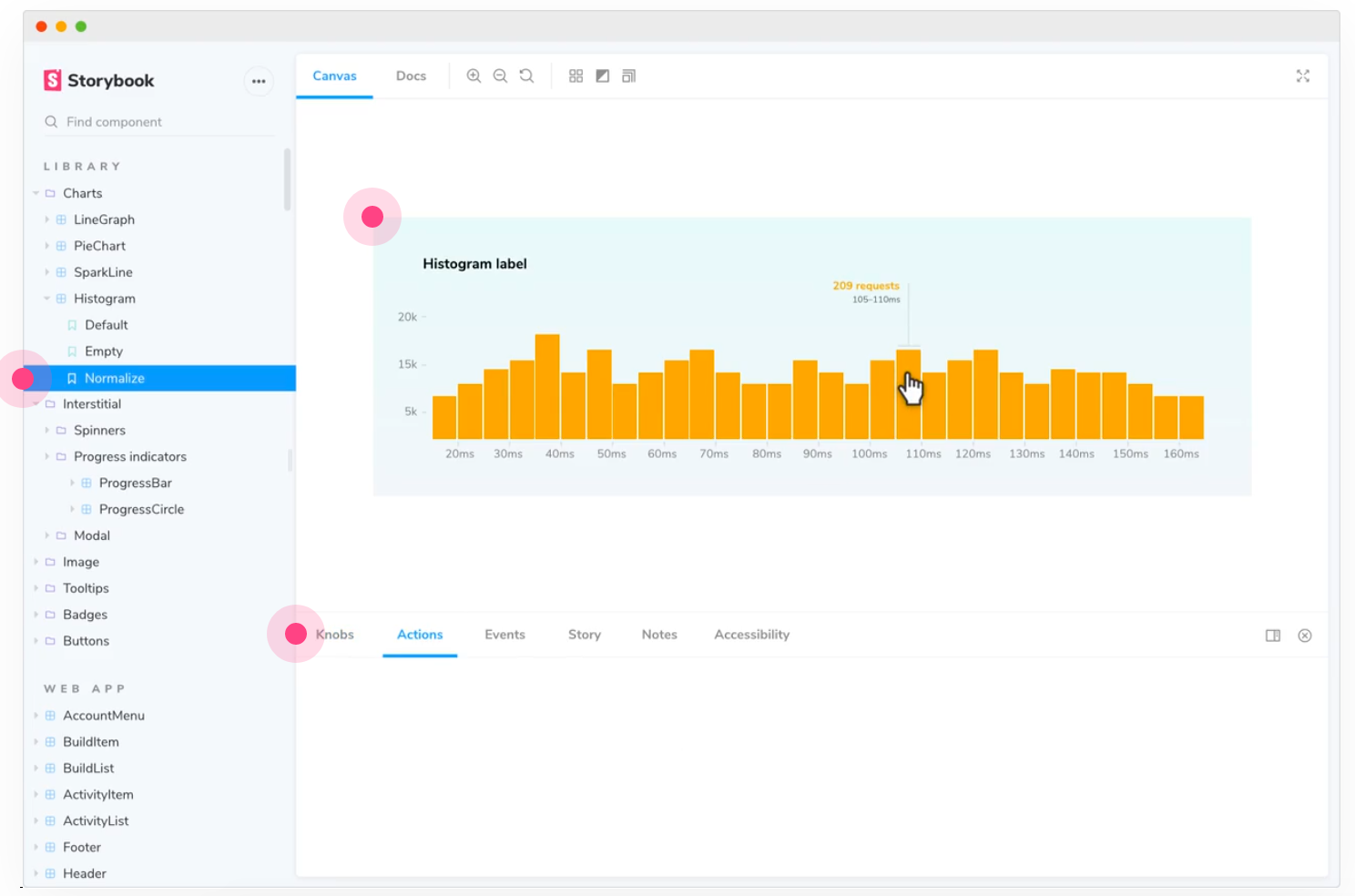
Once installed, you start the local Storybook server via yarn storybook. This command opens a browser tab at http://localhost:6006 and is filled with a number of example React components and their associated stories (more on stories shortly). Checking out these examples is a good place to start. The Storybook app is well-designed with a clean esthetic.
Storybook has an addon system to extend its functionality. Starting with version 6.0.0, essential addons are pre-installed and I found the app to be immediately usable from the start.
Storybook doesn’t magically import your existing React components. However, it’s not a huge amount of work to have a component appear in Storybook. This is also a process you can perform incrementally, adding your most important components first.
Creating stories
When I first started Storybook, I expected to see my custom components immediately. This didn’t happen and I was disappointed. However, I realized this didn’t make much sense as most components require a default parameter values to appear. For example, my alert component needs some text to render:
// src/components/Alert.js
import React from 'react';

export default function Alert({text, alertType}) {
  return (
    <div className={`alert ${alertType}`}>
      {text}
    </div>
  )
}
To view a component within Storybook you need to create at least one story. A story describes an interesting state of a component. For my alert box, I decided to start with Default and Error stories.
Importing a React component into Storybook
Importing a component into Storybook requires just two steps:
- Create a
src/components/[COMPONENT].stories.jsfile with at least one story. Stories follow the Component Story Format. - Restart the storybook server. Restarting is only required when adding a component, not updating an existing component.
My Alert stories file:
// src/components/Alert.stories.js
import React from 'react';
import Alert from './Alert';

export default {
  component: Alert,
  title: 'Alert',
  argTypes: {
    text: {
            description: "The text to display within the alert box",
            type: { name: 'string', required: true },
            defaultValue: "This is the alert text."
          },
  },
};

const Template = (args) => <Alert {...args} />;

export const Default = Template.bind({});

export const Error = Template.bind({});
Error.args = {
  alertType: 'error'
}
I like the separation of stories from the component. Storybook doesn’t force you to modify your component code. The additional functionality provided by Storybook is isolated to stories files. See Storybook’s Story docs for more information on creating stories. Additionally, no Storybook-specific libraries are required when creating a stories file.
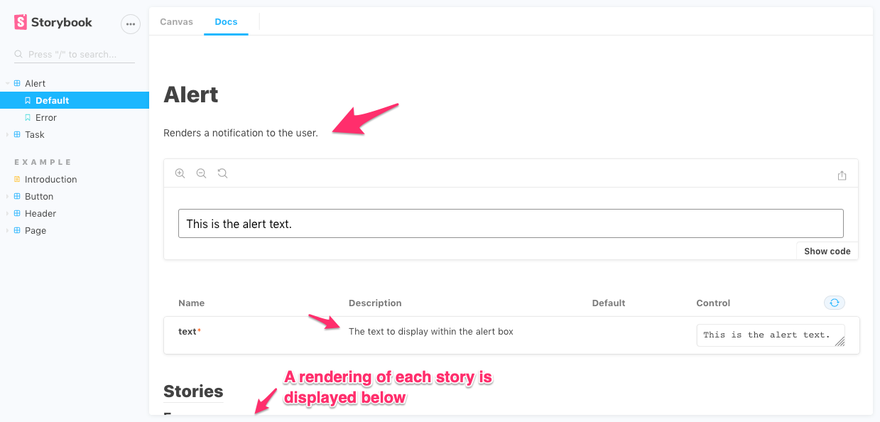
Autogenerating docs
I love great docs. One feature I love about Storybook is its ability to autogenerate docs from source code comments. This creates a single source of truth for docs.
Here’s the docs for the Alert component:
Wait there’s more
Storybook has a robust addon ecosystem that helps you build out an automated DesignOps process. From importing dynamic data to visual testing, there are many ways to integrate Storybook into your existing tools.
TL;DR
Storybook is a polished, well-designed UI component browser that can be extended in many ways. Easy to install and incrementally integrate into your existing apps, Storybook provides a clean separation of Storybook-specific functionality and your existing components.